Chess Repertoire Explorer
Using tree-based visualizations to understand your opening repertoire
MCO
In the hugely popular Netflix show Queen’s Gambit, the first book chess prodigy Beth Harmon receives from her mentor is MCO (Modern Chess Openings).
I don’t have my old copy of MCO - I must have lost or given it away - but I remember it well. A typical page looked like this:
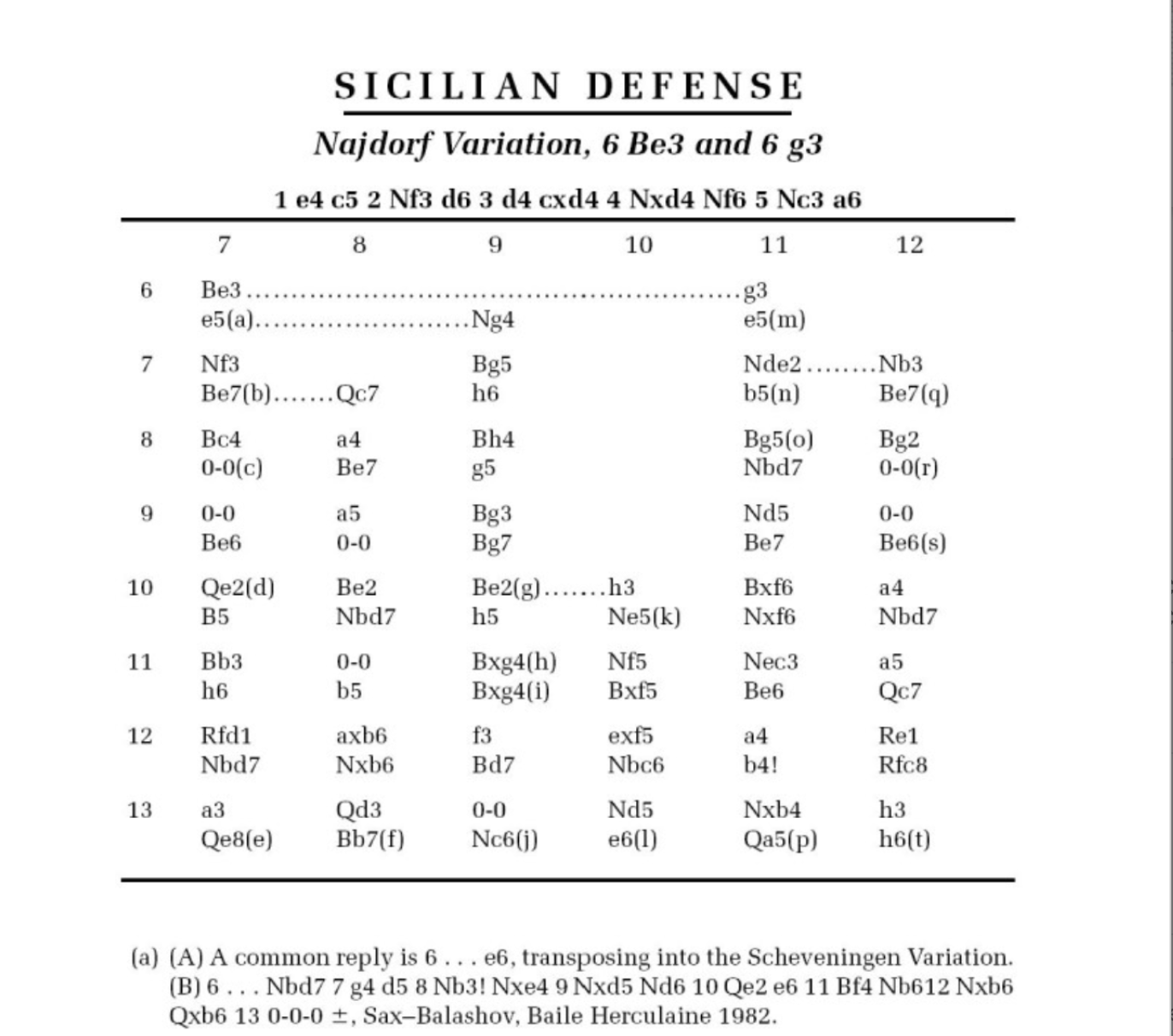
It was basically a giant catalog of opening variations: hundreds of pages, just like this. I think part of the appeal was the sense that something this dry and inscrutable must contain some really deep knowledge.
Intimidating as it was, MCO was the lightweight opening manual. Really serious players preferred ECO, the Encyclopedia of Chess Openings, which consisted of not one but five large volumes. The covers listed the title in multiple languages and the content had no explanatory text whatsoever, just a specialized set of symbols representing evaluations of positions.
The ponderous size and obscure format of these tomes obfuscated something important: On the scale that really counted, the scale of chess, even ECO was tiny.
Consider: Each side has 20 legal moves on move one. Thus, the number of possible sequences after just one complete move is 20 * 20 = 400. The number of possibilities after two full moves is on the order of 20^4 = 160,000. More actually, because many first moves increase the scope of the pieces and make more legal moves possible. And the possibilities increase exponentially from there. So as intimidating as it seems, even ECO only covers a tiny fraction of the possible variations.
Which in turn raises a question: Out of all the countless variations possible in chess, what good is it to memorize the relatively small selection of lines spelled out in these books?
There was never really a great answer to this question. I guess the reasoning was that the books covered the most important lines, as measured by chess logic and grandmaster practice. However, modern computer analysis shows that many of the lines and evaluations in the books were flawed.
This isn’t a knock on the authors, who made a heroic effort at an impossible task. Rather, it just underscores the futility of the underlying approach. It is not efficient or even possible to memorize every sequence of moves that might occur in your games.
Also, there’s the annoying fact that a chess game continues past the opening into the middlegame and endgame. Recalling the math outlined earlier, the branching nature of chess means that each move forward you nudge your repertoire increases the body of knowledge you need to memorize exponentially.
Planting a Tree
Looking at that page from MCO, it strikes me that the authors are struggling against the limitations of their format. The arrangement of the lines and how they relate to each other is confusing. It’s hardly obvious that the numbers along the left side of the page are move numbers whereas the numbers along the top are an index of different variations. It’s not easy to reason about my options in a given line by looking at this page.
Part of the problem is that this format is too beholden to a traditional chess scoresheet. When you play a tournament chess game, you write down all the moves. This is what they’re writing down during the tournament games in Queen’s Gambit. The finished scoresheet looks like this.
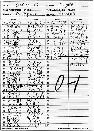
Note that a scoresheet has a linear format: the moves go straight down the page in an unbroken sequence starting from move one. This is fine for a single game, but when we study chess, we’re concerned not just with what happened in one game, but what happened (or could happen) in many games. Thus, the structure of what we’re studying isn’t a line, but a series of branching paths.
This structure is called a tree and it’s very common in math and computer science. An early attempt at using a tree visualization for chess occurred in the famous book Think Like a Grandmaster by Alexander Kotov.
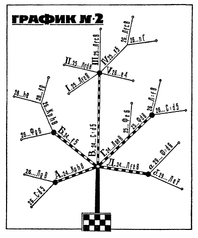
This is a nice attempt to represent the tree-like structure of variations, but still suffers from some obvious problems. For example, it’s clearly not ideal for the text to be slanted at different angles, which contributes to the diagram being hard to read.
Fortunately, these days things are a lot easier. Now that we have computers and graphing libraries, we’re not limited to linear formats that are easy to write or print on a page. We can create visualizations that are rich, interactive, and adaptable.
Using a Sankey diagram to visualize your repertoire
To test these ideas in practice, I made an app that helps you prioritize which openings to study by using a chart type called a Sankey diagram to visualize your repertoire. I’d argue that there are two factors you should think about when deciding which opening to focus on:
-
How often the opening occurs in your games. Clearly, you don’t want to waste time on openings that hardly ever happen.
-
How well you score in the opening. It makes sense to pay special attention to the openings where you’re struggling.
So, which openings occur the most often in your games? And how do you score with your main openings?
These questions aren’t that easy to answer with the existing tools. The best way I know of to do this in ChessBase is:
-
Create a new database of the subset of games you’re interested in. For example, your white games from the past year.
-
Select all the games in the database with Ctrl-A, then do Ctrl-Alt-Enter. (Good luck figuring that out from the documentation!)
This takes you to a view where you can go through your repertoire move-by-move and see how you’ve scored in each line. Useful, but the only way to access the information is to toggle through one move at a time; there’s no top-level summary to let you see what’s going on in the big picture.
I wanted to create a way of visualizing your opening repertoire that would make it easy to answer these questions. The result was this app. It grabs your latest games from lichess and displays them in a way that makes it easy to see which openings occur the most often and how you’re doing in them.
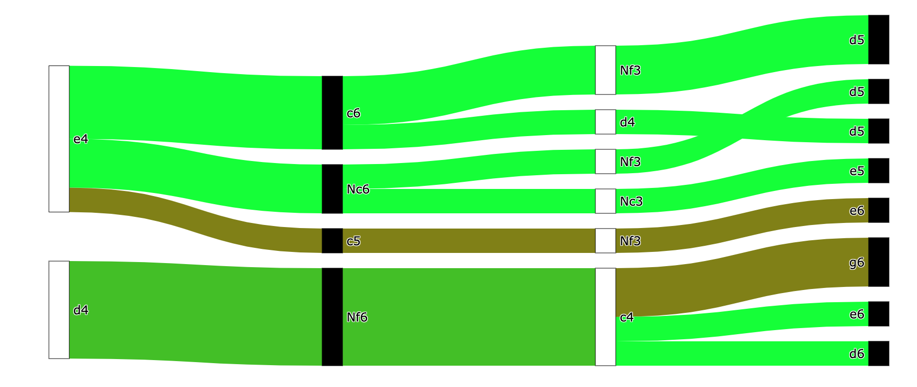
This kind of chart is known as a Sankey diagram. It’s used to visualize flows between various states, which are called nodes. In this case the nodes are positions and the flows are moves.
Nodes are color-coded white or black to show who made the last move, and move numbers are aligned vertically to facilitate comparison between lines.
The thickness of the flows represents how often that variation occurred. For example, a variation that only happened in one of your games will be a thin line, whereas a variation that happens frequently will be a thick flow. The flows are color-coded by how well you scored in that line: green represents a 100% score (you won every game), red represents a 0% score (you lost every game).
Based on the prioritization system introduced at the beginning of this article, you should focus on relatively thick, red areas, because these represent lines that happen a lot in your games and where you struggle.
You can use the app to create this diagram for the last 100 blitz games of any player on lichess. For example, here’s the chart for world champion Magnus Carlsen (DrNykterstein on lichess):
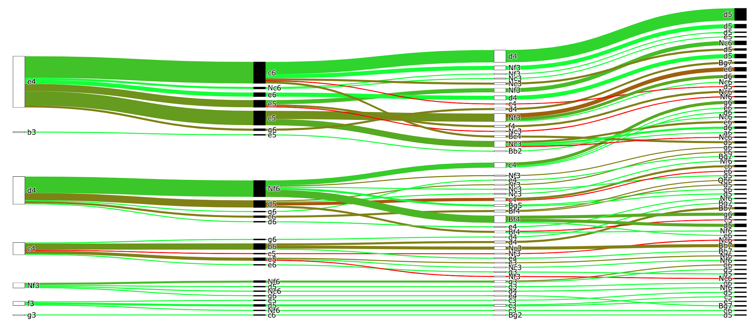
Unsurprisingly, Magnus is doing pretty well, but in this sample he’s not scoring as well with the English (1. c4) as with 1. e4 or 1. d4.
The biggest thing that jumps out about this chart, of course, is just how many lines there are. This is both a feature and a bug. It’s a bug because it clutters the chart, making it harder to use for its intended purpose of evaluating your opening repertoire. However, it’s also a feature, because it reveals something true about chess that traditional ways of writing down moves obscure: namely, there are an insane number of possibilities.
I don’t know how many players will find this app to be a useful way of exploring their opening repertoire, but I’m confident that there’s a lot of room for tree-based techniques to improve how we visualize and think about chess.